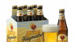
Description
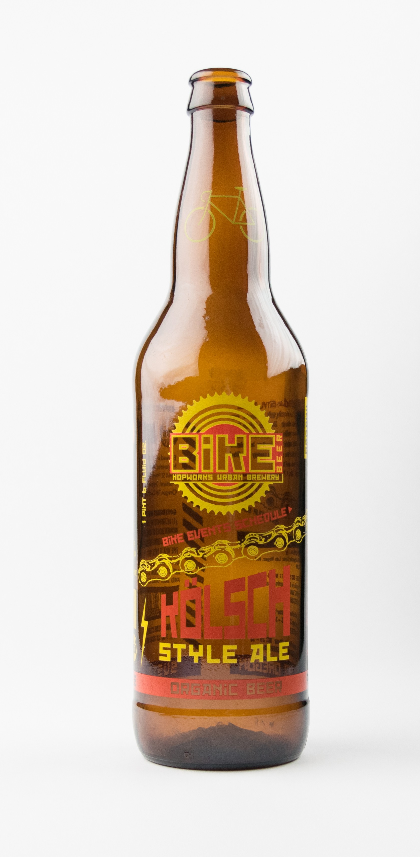
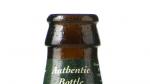
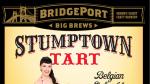
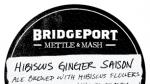
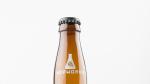
This bottle represents some of Hopworks' common labeling design elements. The target shaped HUB logo is re-purposed into a gear but is still recognizable because of the color scheme. The bike chain, Bike Beer name, and words "bike events schedule" reflect Hopworks commitment to both local bike culture and community involvement. Red October, a typeface inspired by Russian constructivist art and which is often used throughout Hopworks' marketing, adds an industrial feel.
Download Files
Related content


Collections with this item
Details
Extent
- 1 bottle
Contributors
Digital Publisher
Subject.Topic
Subject.Place
Language
Rights & Usage
In copyright. Used by permission of the copyright holder, who retains publication rights thereto. Use of materials from this collection beyond the exceptions provided for in the Fair Use and Educational Use clauses of the U.S. Copyright Law may violate federal law.
Identifier
- PUpic_000702
Add new comment